Thursday 22 December 2022

Fragments of pulp heroes, heroines and villians.


My biblionautic chums and friends.
For the last week or so I have what we call in the trade 'Creative Block' It happens to us all at some time or other. Hence the studio tidy up and xmas decorations (please see previous posts) Some of the best advice I was given on blocks and how to work with them was by a good friend of mine, now sadly in the great gallery in the sky ... Mel Gooding.. Mel Gooding He suggested that I should revisit the past anew. By this he indicated that one should re-look at, re-appraise past works or memories. To understand that we are always moving forward and what we did then we would, in all probability, do and understand differently. 
 
The past becomes a starting point. 
 
In this particular instance childhood memories of sci-fi comics scattered on the bedroom floor on rainy weekends. The deft strokes of the illustrator, the simple, bold colours and gripping dialogue taking me to strange and wonderful places. At night I would re-live the daring escapades of my pulp heroes and heroines during that twilight of wakefulness and sleep.
So a new book begins to take shape, fragments of pulp heroes, heroines and villians. 42cm x 30cm.
Please note.... there are other blocks and studios/binderies doing stuff, spelling and grammar. Please further note, the opinion of the author may change at any moment. This is due to having an open mind of sorts.


Wednesday 21 December 2022

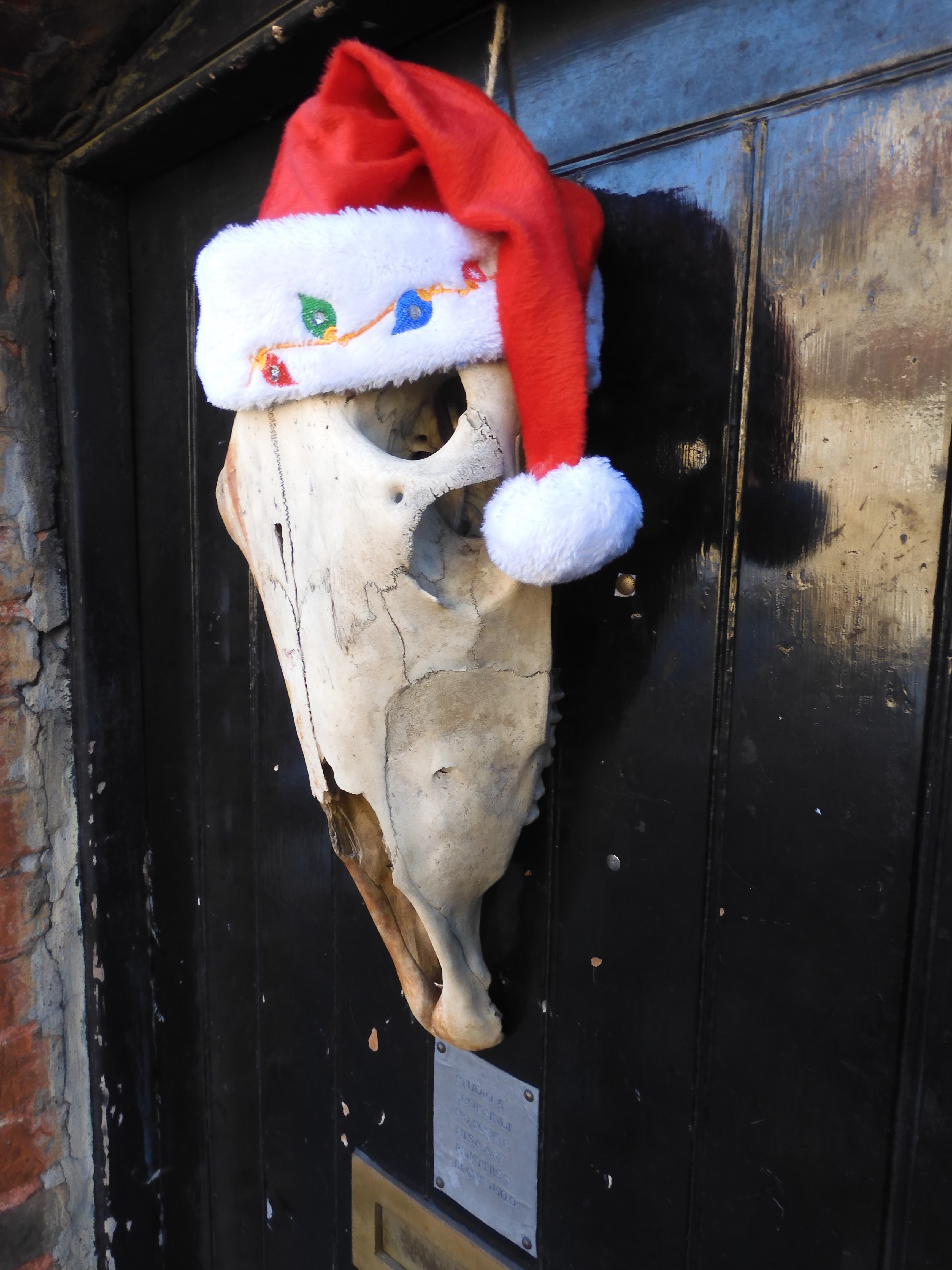
Christmas in Studio 5 Book Arts.


My biblionautic chums and friends.
A couple of things usually happen at this time of year in Studio 5. First is a tidy up, this year has been no different... 3 days and numerous dustbin bags have resulted in, well, in what can be only described as appearing to be no change from before.
Next is the Chrstmas decoration to the studio door. I thought I would opt for something a little less traditional. Odd, at this time of year I usually have any number of visitors!
Please note.... there are other Christmas decorations and studios/binderies doing stuff, spelling and grammar. Please further note, the opinion of the author may change at any moment. This is due to having an open mind of sorts.


Tuesday 13 December 2022

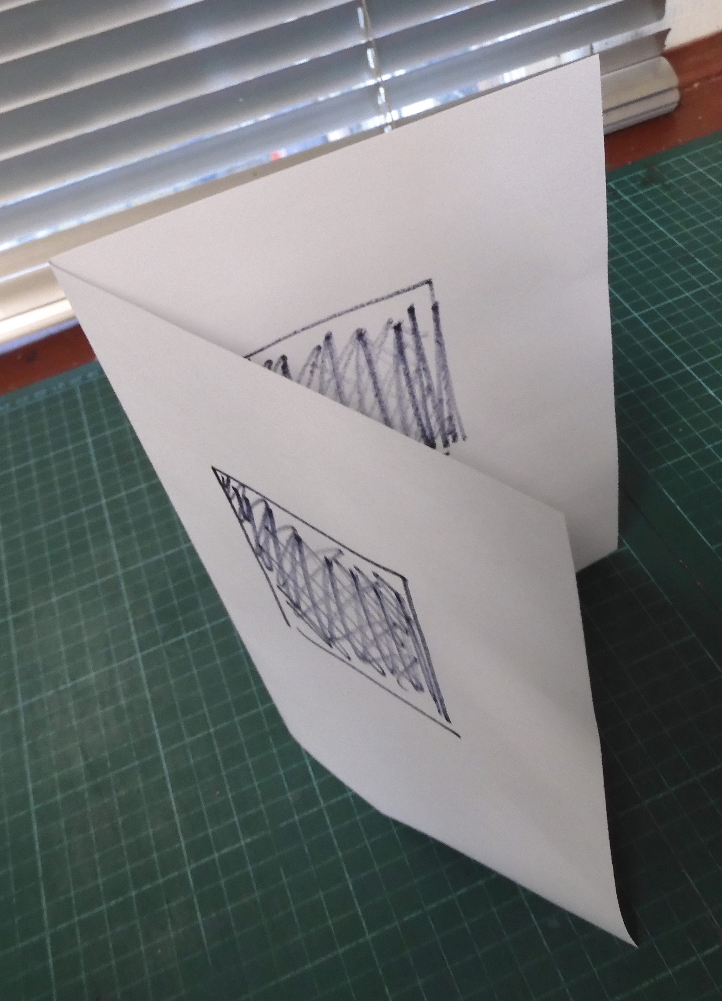
Aspects of the Flat Back Case Bound Book.

My biblionautic chums and friends.
I thought I might share this short film thing.
Please note.... there are other films and studios/binderies doing stuff, spelling and grammar. Please further note, the opinion of the author may change at any moment. This is due to having an open mind of sorts.
https://www.youtube.com/watch?v=-tNliTSkDm4


Monday 12 December 2022

Teaching at Flatford Mill. Dates are available for 2023!


My biblionautic chums and friends. More dates are available for 2023!
Please note.... there are other courses, studios/binderies doing stuff, spelling and grammar. Please further note, the opinion of the author may change at any moment. This is due to having an open mind of sorts.
 

Sunday 11 December 2022

G H I. Gaudium Hora Inceptum. Gaudium = Joy/Happiness Hora = Time/Season Inceptum = Beginning


My biblionautic chums and friends.
So, after Barbados I was in London. A day to clear the jet lag and get use to the weather found me at Maggs Bros https://www.maggs.com/ setting up the DesignerBookbinders winter exhibition. https://designerbookbinders.org.uk/

G H I. Gaudium Hora Inceptum. Gaudium = Joy/Happiness. Hora = Time/Season. Inceptum = Beginning.


As with all things the set up was a team effort and my thanks goes to all that helped. With the set up done it was time to relax for a day as the private view, the following evening beckoned.


 Marvelling over each book, reflecting on the dexterity and artistry of the makers, mince pie in hand, chatting with friends old and new, GHI actually reinforced my notion that if there is no other option things online are okay… but nothing can replace actually being there.

26 books/bindings by 21 Fellow and Licentiates of Designer Bookbinders makes for a rather wonderful show. What I really like about exhibiting at Maggs is the fact that the books are not behind glass. One can get up close and personal. The books are in the 'Front Room' of Maggs, arranged in a modern book case. Subtle lighting and decorated tree make for an environment that is more akin to how I see the modern library or collection.


 Lester Capon (President of Designer Bookbinders, right) with Ben Maggs, who, along with Sophie Schneideman was awarded Honorary Fellowship during the private view of GHI, in recognition of services to bookbinding and/or Designer Bookbinders.


For more information please visit Maggs https://www.maggs.com/  

To view the catalogue https://www.maggs.com/media/5570916/ghi-catalogue.pdf

Better still..... Go there in person if you can.

Please note.... there are other studios/binderies doing stuff, spelling and grammar. Please further note, the opinion of the author may change at any moment. This is due to having an open mind of sorts.


Wednesday 16 November 2022

Investment... Study the past, if you would divine the future.


My biblionautic chums and friends, please forgive the lack of posts over the last two or so weeks. I have been a little busy teaching/sharing various things with the Department of Archievs and Library Services - Barbados.

Before anything, the first image I have posted is as close to a beach as I have come and it was raining. I am not a beach person.

Recently the Department of Archives (DoA) has been on the receiving end of government investment that has resulted in the refurbishment of premises and equipment. In addition funds have been made available for training etc... 'Wait a moment' I hear you say....'A government that is investing in archives, training etc?' I know... it is hard to beleive, but it is true.
Mia Amor Mottley, SC, MP is a Barbadian politician and attorney who has served as prime minister of Barbados since 2018 and her government are investing in the preservation of the past to ensure that the history of Barbados and it's people is kept alive and available for now and the future. As Confucius said..."Study the past, if you would divine the future."

With a new main workshop, wet room, fumigation room, cold room, the dirty room ( a room for doing all those messy jobs that may make dust) and plenty of storage. It is like a new begining, though there are some materials I realise that further investment is required to up-date key equipment such as board chopper, presses etc. But what is important is the fact (from my perspective) that there is an investment in the conservation/restoration members of staff in further training.

More posts to follow.

Please note.... there are other studios/binderies doing stuff, spelling and grammar. Please further note, the opinion of the author may change at any moment. This is due to having an open mind of sort.


Sunday 6 November 2022

Barbados. Books and a Hippo.


My biblionautic chums and friends.
Barbados, the bearded ones. For those of us who may required a little more information on this intriguing Island Republic I would suggest a quick visit to https://en.wikipedia.org/wiki/Barbados
For some of us Barbados is a holiday destination, perhaps for more it is a 'one day' holiday destination. But it is always the home for near 300,000 people.
So, you may ask, why am I posting about Barbados? Well chums, it is not about beaches and cliff top walks. It is work. I am teaching stuff at the Department of Archives, Bridgetown. In addition I will be giving an illustrated talk at the Barbados Community College: Division Of Fine Arts on the 14th of November on aspects of my work that include design binding, book arts and a hippo.
Image by Quinzell Dawson.
Please notethere are other studios/binderies doing stuff, spelling and grammar. Please further note, the opinion of the author may change at any moment. This is due to having an open mind of sorts.

Tuesday 18 October 2022

Romeo and Juliet.


My biblionautic chums and friends.
A binding that I had finished forwarding, sorting out the pagination and stuff a little while ago.

I halted, sat on it for a while. I wanted to think about the design. The one thing I did know was that I did not want it to look like some cheesy, 1920's/30's hollywood B movie poster. This book did not need the bling of gold and everything else thrown at it.

Romeo and Juliet, perhaps the best know and performed of Shakespeare’s work. This particular edition has had a life. Many annotations, underscoring, stage directions and notes litter the pages. One can imagine the actors learning their lines, adding to previous notes, marking their lines and so forth. These squiggles have informed the design of the tooling to the front board, squiggles and lines creating a stylised balcony.
A simple treatment.

Full Palimpsest Parchment binding. Leather jointed end papers to edge to edge paper doublers. Single needle sewn end bands.

Please note.... there are other studios/binderies doing stuff, spelling and grammar. Please further note, the opinion of the author may change at any moment. This is due to having an open mind of sorts.


Friday 16 September 2022

La Ville, box and all.


My biblionautic chums and friends.
Finally... La Ville is completed.
Please note.... there are other boxes and studios/binderies doing stuff, spelling and grammar. Please further note, the opinion of the author may change at any moment. This is due to having an open mind of sorts


Monday 12 September 2022

Monday Morning... What Could Possibly Go Wrong?


My biblionautic chums and friends.
Ah, Monday morning, what could possibly go wrong?
When the person who borrowed your electric saw "forgets" to tell you that they have broken it when they return it.....
Push-hate, pull-hate, push-hate, pull-hate etc etc....
Though I am a little happy that I am still able to saw in a straightish line.
Please note.... there are other studios/binderies doing stuff, spelling and grammar. Please further note, the opinion of the author may change at any moment. This is due to having an open mind of sorts


Thursday 8 September 2022

La Ville, an abridged story of the binding.


My biblionautic chums and friends.

La Ville... Aa abridged story of the binding.

Frans Masereel (31 July 1889 – 3 January 1972) was a Flemish painter and graphic artist who worked mainly in France, known especially for his woodcuts focused on political and social issues, such as war and capitalism. He completed over 40 wordless novels in his career, and among these La Ville is considered to be one of his best.
Masereel's woodcuts influenced Lynd Ward and later graphic artists such as Clifford Harper, Eric Drooker, and Otto Nückel...... and me of course!
 
The binding of La Ville is a commission from a collector of books, it is always nice to be commissioned to do work by this particular collector as he has a fantastic eye for text blocks that are beautiful, challenging, quirky or fun. La Ville is no exception, the wood-cuts of Masereel are something that one can really get one's teeth into. 

 Along with the original text block in sheets (more about this later) I was supplied with a reading copy. The reading copy was very cool to have. First I was able to check and correct the pagination of the sheets and use the reading copy as, well, a reading copy. To  be able to understand the nature of the 100 images, their relationship within the flow of the pages, to formulate a design.
 
With La Ville being first published in 1925 it would have been easy to default to and  produce a 1920's style binding, perhaps even in the French/Flemish style.

But, and it is a series of big buts...... Masereel's wood cuts are so visceral. By this I mean that there is an earthy feel to the work. The images detail all aspects of urban life, much of it the same now as it was then. From the tenderness of the new-born through to the unreasoning divides in class and culture and the elemental emotions of death and depravity. His work is instinctive and in depth. This I wanted to keep, this was my key to unlock the overall design, look and feel of the book.

So.... a slick binding full of colour and gold, inlays and onlays would just not work. The images in the text block are stark and powerful in the simplicity of printing. I kept coming back to black and white, light and shadow. And so began a series of maquettes.
A maquette is a scale model or rough draft of an unfinished sculpture and as I have often thought that the book is sculptural in form I tend to use the term maquette.
 
One of the key aspects I wanted to use was light and shadow/black and white. 
First I tried to sculpt the board, creating form with various thicknesses of paper then covering with leather. It just did not have sharpness or clarity that I was looking for. Masereel... a fantastic wood cut artist.. me not a fantastic wood cut artist.. but I can do do lino. Perhaps, in hindsight it is an obvious technique for me to employ but it took time to work towards using lino cuts to get where I wanted to be.
It became instinctive.. it worked... I was getting there. 


As with any research it can take you to places that are perhaps not suitable for the current project but well worth remembering


Once I had sorted out what and how I was going to be working, the technique at least I turned my attention to the text block. As mentioned before, it was in sheets. many sheets. Basically a series of folios, simply  the paper folded with two prints on each folio...
Easy for the printer... a nightmare for the binder. To sew each section would have been so difficult, the swell not easy to manage. In addition, to compound the problems no two folios were the same size. Some with the deckle edge to either the head or the tail.. some with no deckle...all over the place.
Having worked with art printers I had a solution, simple, strong and workable. Basically to join three folios together with a Kozo (Japanese paper) hinge and sew through the center folio.

 
A simple solution. I guess from experience. It is something I have found with artists and many, many art printers, they tend to do the art work/printing and then think of how they will make it into a book, or, as is often the case, give the task to some poor bookbinder and expect miracles. Bookbinders tend to think of the book in totality, each separate part forming the whole.
 
Now that the construction of the text blocked had been sorted out I turned my attention to the end papers. This time the choice of medium was easy... yep... lino cut.

 My aim was to produce a montage of abstracted Masereel prints for each end paper and doubler. Slowly building up the image as I worked. Taking rubbings as I worked the lino to ensure that all was ok.
 

The first prints in the print rack. Great fun to do but this was only stage one, I wanted to explore light with the end papers/doublers. More about this later.


With the leather ordered from Harmatan https://www.harmatan.co.uk/ (my go to leather people, in fact I have been using their leathers since I was at college more than 30 years ago... please note other tanners are available) and all the componets in place work could bein in bringing all together. The decision was made to trim the sections, taking minimum of to neaten the text block up. Not an easy choice to make but because of the nature of the unevenness of the sections it was the practical thing to do. Sewing, rounding and backing, end bands and all the other little steps that make up the journey of the making of a book commenced.
The leather was worked during the covering process, the play of light and shadow more than evident form the first. The leather from Harmatan was a joy to work with, having a relationship spanning 30 plus years helps. I know their products, they know what I am looking for when I describe the effect I am after and I always consider them to be part of the binding team. As indeed I do my other suppliers such as John Purcell Papers https://www.johnpurcell.net/ again the staff have knowledge of the papers, boards etc they have. They care and understand they don't just sell. Please note other paper and board suppliers are available.
Finally the binding complete........
Light and shadow.
Remember the end papers and doublers? Depending on the angle of light and viewing changes what is and is not seen.


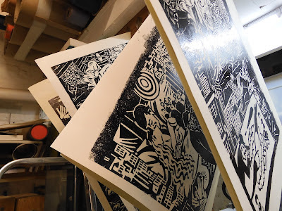
Simple. It would have been easy to go full out and having lashings of gold and inlays and onlays... but why fight the wonderful images? I have taken my inspiration from Masereel's prints. Abstracted and twisted, reformed and re-seen.

Full leather (goat). Hand printed end papers and edge to edge doublers. hand sewn, single needle/minimal end bands etc etc. 286mm x 235mm x 31mm when closed.

Please note.... there are other studios/binderies doing stuff, spelling and grammar. Please further note, the opinion of the author may change at any moment. This is due to having an open mind of sorts.