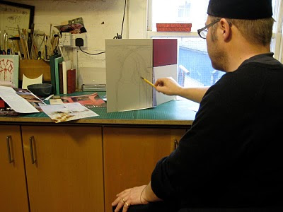
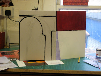
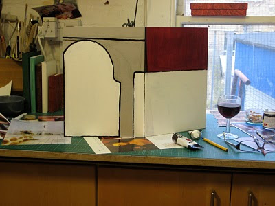
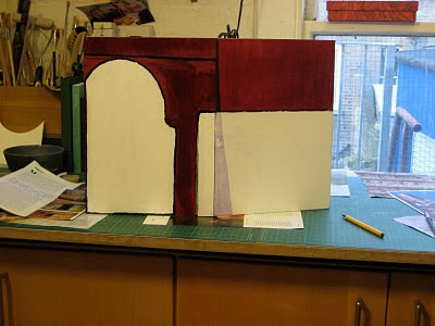
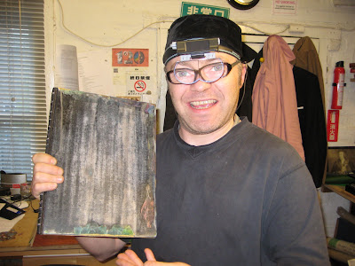
The final work in this series. I hope it will be on exhibition in April at the Flow Gallery in London..........
Tuesday, 23 March 2010
Meditations Interrupted 3
The final work in this series. I hope it will be on exhibition in April at the Flow Gallery in London..........
Saturday, 13 March 2010
Brilliant Creatures.
Friday, 26 February 2010
Monday, 22 February 2010
The Four Gospels. Collage and paint.
The Four Gospels. Working 4 ways.
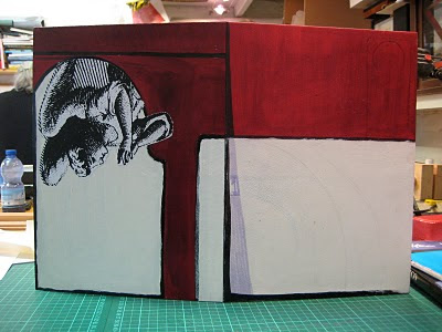
One of the design ideals is that the Four Gospels has a design that works in 4 ways. First is that the design works in a pictorial form with the four becoming one. Perhaps fragments of individual faces forming one coherent image.
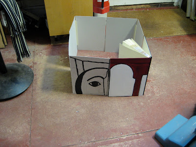
Second is the four to work in the round.
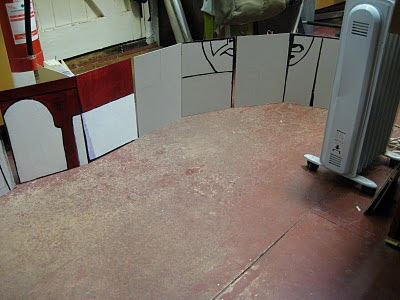
Third is that the four work in a panorama.
Finally, that the end papers work in the linear (more on this later)
The design is fluid at the moment but am very much thinking about collage and using paint. The texture and colour....... we will see what develops.
Wednesday, 10 February 2010
The Four Gospels. Boards on and designing.
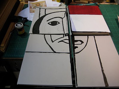
Both boards are on the maquette and the book structure looks as if it is going to work. Now comes the design process. With this sort of work I tend to work directly on the boards. First I pencil in the lines, notes on colour and the like.
Then I paint the black lines in. I have chosen to use a quick dry, cold enamel paint. I like the way the line works, the tension of the thick and thin. I some ways I am beginning to treat this book in much the same way as Icons. The more I work this way the more my interest is heightened in mixing media.
Next is the white ares. This is in acrylic with these areas being made ready for the collage work. The way the brush leaves small lines catches the eye, this exercise is fun.
Finally, for the time being that is, the red is applied. Again acrylic and again with a brush. I am hoping to create a stained glass effect. The image will be of a stylised arch with biblical middle and back grounds glimpsed through the arch (back board) with a winged man (sign of St Mark) with an Icon like image of part of St Mark's face. I am quite excited,
Friday, 29 January 2010
The Four Gospels. Design and materials.... head work.
I have spent the last week looking at folded pieces of paper. Working out the design for the Big 4 (The Four Gospels)
There is so much to go for, the lives of the saints, the colours and various clues in Icons. The materials of the time... now and in the past.
It is my intention that the Big 4 works in four design parameters, one has been sorted out with the end papers and doublers. The other three will be visible when the books are displayed. Some serious head work !
During the research I have looked at treasure bindings, books of hours, Icons, statues... the list goes on. The more I think, the more I am leaning towards a combination of past and now. Leather and mixed media. One thing I am sure of is that no two boards will be the same, even to the point were the two boards on the same binding will be of different sizes. This will create a silhouette that is not regular, breaking the square or rectangular format of the book.
Next is to put into practise on the maquette the various techniques I hope to use.
Thursday, 21 January 2010
The Four Gospels. Overlapping boards to the spine.
With the leather on the spine, leather joint in place and the doubler wrapped around the inner boards it was time to work on the outer boards. The aim is to have the boards meet in the middle of the spine. This will provide a large flat surface for the art work and stuff.
View of the book laying down with one of the outer boards in place. The work looks a bit rough because this is the maquette, all the practice and working out is down on this before I go on to the real books.
Friday, 15 January 2010
The Four Gospels. Board lamination and beveling.
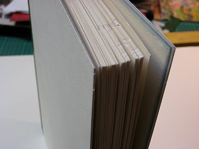
With any new technique or variations of method I work everything out on a maquette (a practise book) The boards are a series of laminated water colour paper and manila. As this is a going to be a double board binding I have beveled the inner squre to reduce the bulk and give a more delicate edge to the finished book.
By chance the resulting edge looks cool, the various layers of the water colour paper and manila offer an unusual decorative element , this will be covered with the doubler but is well worth remembering for future projects.
How the edges look with the book standing.
Sunday, 10 January 2010
The Four Gospels. New commission.
The Four Gospels... A re-print of the famous Four Gospels by The Golden Cockerel Press. Fantastic stuff, lavish with the work of Gill, it does really deserve a place in the top 4 of the all time greats.
Originally intended as one volume, I have split the book in to four (lots more work) Matthew, Mark, Luke and John. The end papers have all ready been printed, the text block sewn and now it is time for the edge decoration and end banding.
First is the application of a base colour. Purple, purple is often associated with royalty and God. During my research I have found that colours have as much meaning as the symbols and signs in Christian art.
Next is the modern Gauffering. Bronze foil is layed over the edge and tooled with a hot brass tool. The secret is to have a hot tool, pressure must be light as there is the risk of the edge being damaged. Of course if you are wanting a heavy texture to the edge then by all means press away... practise first. Patience is the key.
Last is the end banding. I have decided that I wanted to keep the endbanding as simple as possible. I have thought for a long time that the strength of the end band is in the tie downs. The wrapping of the silk or what ever around the core is for decoration. So, remembering to keep it simple I pared a lot of leather very thin. I then rolled up these thin pieces of leather into mini Swiss rolls. A number of these rolls where then placed side by side and sandwiched between some purple (again) and red leather. The whole lot was then pressed to a 3mm thickness and allowed to dry.
I used a thin PVA (Fevicole in India) and worked as quickly as possible.
This block of swiss rolls was the cut in to 2mm strips to form the end band core. Sewn only at the tie downs (the middle of each section) with silk (purple....again!) What the image does not show are the beads on the tie downs.. in red silk (red is for emotions. Love, hate, blood etc)
Saturday, 9 January 2010
Monday, 4 January 2010
Mersey. The River That Changed The World. The final panel in place.
Wednesday, 23 December 2009
Mersey. The River That Changed The World. It all begins to take shape.
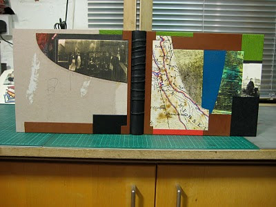
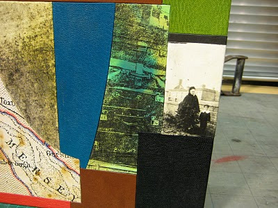
The main construction of the book has been completed, now it is a case of applying the various panels. I am still keeping with the idea of the human element. The brown leather is hide, the same stuff that is used to cover suit cases... in fact the leather is from an old suit case.
The spine is an old leather glove. I love the texture. I always think of a lost single glove as the idea of some one passing, perhaps to start a journey, perhaps finishing their journey or en-route.
The front board in some detail. The image is of young boy and, well I like to think of the other person as his Grandma. The image is from my personal collection of old glass negs.
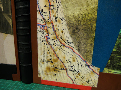
I feel that the shapes lend a nautical feel, shapes of hulls and the like. The map is derived from one of about 1870, aged and hand tinted.
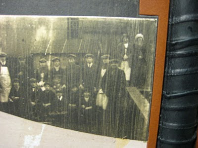
Detail of the back board. Again an image from my collection, workers......
Tuesday, 15 December 2009
Mersey. The River That Changed The World.
A new commission.
As the title would suggest the content is about the River Mersey, the river, the buildings on the banks, the great, the good and the everyday. It also has a human perspective, people who work on the Mersey, travelers, dockers and artists.
A fascinating book chock full of images...
I have decided to concentrate on the human angle to the Mersey, perhaps indicating the recent past and the now.
First is the end papers.

Suit cases piled on the dock side.
As the title would suggest the content is about the River Mersey, the river, the buildings on the banks, the great, the good and the everyday. It also has a human perspective, people who work on the Mersey, travelers, dockers and artists.
A fascinating book chock full of images...
I have decided to concentrate on the human angle to the Mersey, perhaps indicating the recent past and the now.
First is the end papers.
Suit cases piled on the dock side.
Saturday, 28 November 2009
Thursday, 19 November 2009
The Lives Of Gallant Ladies, Cold Gold tooling.
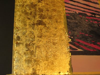
The gold leaf was applied to the pre dyed surface of the leather (on the book) and worked over with warm tools. The design is fluid, free hand if you like. This is not as easy as it sounds, working to a design ensures that mistakes are worked out before the tool is even used. However, I sometimes feel that working to design can result in work that is rigid and cold.
When the tooling was complete the surface of both books was worked over with a very fine wire wool. This reveals the dye work underneath creating a number of layers.
Friday, 6 November 2009
The Lives Of Gallant Ladies, 5 books of gold leaf later....
The surface of the leather has been worked over with a very fine silicon carbide paper and lots of small pieces of gold leaf have been applied to the surface. Each square of gold leaf is about 1.5mm square and overlaps the squares next to it.
It has taken longer than i expected... about 2 days longer in fact.
Over the weekend I will be hoping to create more texture by pressing various things into the surface and tooling in a more trad way.
Saturday, 17 October 2009
The bookbinder at work... love
A OUTRANCE is, at last, finished. Following a bout of some detailed stuff on the book one of the students took this very charming image of 'The Bookbinder at Work' Sad.
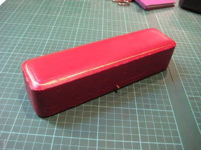
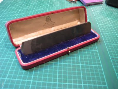
When does a bookbinder love their tools too much ? I would suppose when the bookbinder buys an antique box from the well known and much loved jewelry company of hamilton and Inches, 88 Princes Street, Edinburgh (by Appointment)
Love is a wonderful thing.........
Friday, 2 October 2009
Subscribe to:
Posts (Atom)