My biblionautic chums and friends.
La Ville... Aa abridged story of the binding.
Frans Masereel (31 July 1889 – 3 January 1972) was a Flemish painter and graphic artist who worked mainly in France, known especially for his woodcuts focused on political and social issues, such as war and capitalism. He completed over 40 wordless novels in his career, and among these La Ville is considered to be one of his best.
Masereel's woodcuts influenced Lynd Ward and later graphic artists such as Clifford Harper, Eric Drooker, and Otto Nückel...... and me of course!
The binding of La Ville is a commission from a collector of books, it is always nice to be commissioned to do work by this particular collector as he has a fantastic eye for text blocks that are beautiful, challenging, quirky or fun. La Ville is no exception, the wood-cuts of Masereel are something that one can really get one's teeth into. 

Along with the original text block in sheets (more about this later) I was supplied with a reading copy. The reading copy was very cool to have. First I was able to check and correct the pagination of the sheets and use the reading copy as, well, a reading copy. To be able to understand the nature of the 100 images, their relationship within the flow of the pages, to formulate a design.


But, and it is a series of big buts...... Masereel's wood cuts are so visceral. By this I mean that there is an earthy feel to the work. The images detail all aspects of urban life, much of it the same now as it was then. From the tenderness of the new-born through to the unreasoning divides in class and culture and the elemental emotions of death and depravity. His work is instinctive and in depth. This I wanted to keep, this was my key to unlock the overall design, look and feel of the book.
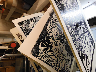
So.... a slick binding full of colour and gold, inlays and onlays would just not work. The images in the text block are stark and powerful in the simplicity of printing. I kept coming back to black and white, light and shadow. And so began a series of maquettes.

One of the key aspects I wanted to use was light and shadow/black and white.
First I tried to sculpt the board, creating form with various thicknesses of paper then covering with leather. It just did not have sharpness or clarity that I was looking for. Masereel...
a fantastic wood cut artist.. me not a fantastic wood cut artist.. but I
can do do lino. Perhaps, in hindsight it is an obvious technique for me
to employ but it took time to work towards using lino cuts to get where
I wanted to be.
It became instinctive.. it worked... I was getting there.


As with any research it can take you to places that are perhaps not suitable for the current project but well worth remembering
Once I had sorted out what and how I was going to be working, the technique at least I turned my attention to the text block. As mentioned before, it was in sheets. many sheets. Basically a series of folios, simply the paper folded with two prints on each folio...
Having worked with art printers I had a solution, simple, strong and workable. Basically to join three folios together with a Kozo (Japanese paper) hinge and sew through the center folio.

Now that the construction of the text blocked had been sorted out I turned my attention to the end papers. This time the choice of medium was easy... yep... lino cut.
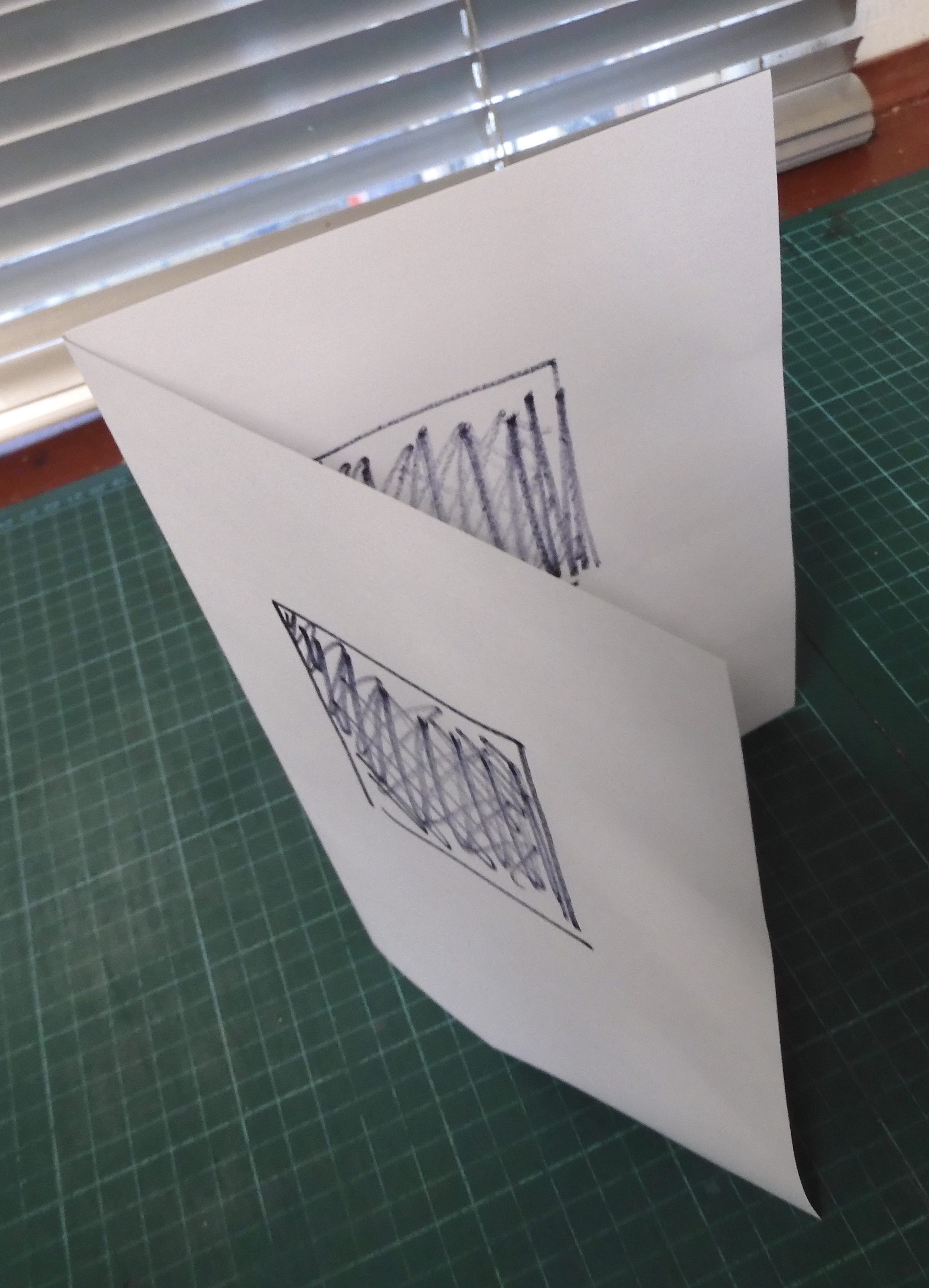
My aim was to produce a montage of abstracted Masereel prints for each end paper and doubler. Slowly building up the image as I worked. Taking rubbings as I worked the lino to ensure that all was ok.


Finally the binding complete........ Light and shadow.
 Remember the end papers and doublers? Depending on the angle of light and viewing changes what is and is not seen.


Simple. It would have been easy to go full out and having lashings of gold and inlays and onlays... but why fight the wonderful images? I have taken my inspiration from Masereel's prints. Abstracted and twisted, reformed and re-seen.
Full leather (goat). Hand printed end papers and edge to edge doublers. hand sewn, single needle/minimal end bands etc etc. 286mm x 235mm x 31mm when closed.
Please
note.... there are other studios/binderies doing stuff, spelling and
grammar. Please further note, the opinion of the author may change at
any moment. This is due to having an open mind of sorts.
No comments:
Post a Comment